My earlier post on the dimming of KIC 8462852 that might be observable in the AAVSO photometry was looking for a single trend line, which seemed to be just observable above the noise. I hedge there, because there are always assumptions not far below the surface that might spoil the result. The human brain and randomness are old enemies, and often when we want to see a pattern, it's just nature playing tricks on us.
As more and more data came in, my visual impression of the data suggested to me that the light curve was fairly flat for the first few hundred days after AAVSO started taking data in 2015, and then sloped downward for about 100 or more days.
In May 2017, we had a small dip, and this month (June of 2017) we've had another shallow but prolonged dip:
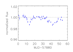 |
| Plot by Tabetha Boyajian of the May and June 2017 dips |
These dips are really below the AAVSO noise level and are just barely discernible in their data if we hold our breath and look cross-eyed at their light curves:
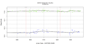 |
| AAVSO data plotted at times of two dips |
This plot of the "V" and "B" bands from the AAVSO data (averaged into 1 day bins for each of the 19 observers used), shows just what I mean. A 1% or 2% dip is just too subtle. As I write this (29 June 2017), it's not clear that the second dip is over yet. The black line drawn through the points is the R script's best effort at fitting
a linear spline through the points while trying not to overfit - i.e. trying not to chase noise. The two red dotted lines represent the 18th of May and 11th of June 2017 - about when each dip started.
However, it is possible to see long term trends. Here's what happens when we ask the the linear spline algorithm (called
earth()) to limit the wiggles in the fit and just look for the big trends with the same 19 AAVSO observers.
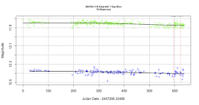 |
| Plot over 638 days of AAVSO B and V data + pruned earth() spline fit |
You can see a clear dimming trend. We have the most data in "V" band, and you can see there the curve is flat for about 286 days (early August 2016), when it turns downward at a rate of almost 3% per year (0.028 magnitudes/year). Even by eye, the trend appears to be unmistakable. In "B" the turning point seems to be coming a bit earlier, but the rate of decline is similar - about 2% per year. The trends in "R" data are similar. This is not that different from what
Montet and Simon saw in the Kepler Full Frame images, just before the big series of dips in the stars light curve near the end of the Kepler primary mission.
So, the notion that the long term dimming and the dips are related may be true, but the long term dimming isn't a constant. there may be long periods when the lightcurve is flat. I have a sense we're about to find out.
All my data and scripts are
on github. Feel free to have a look and reach your own conclusions.


No comments:
Post a Comment